What do the colours in the utilization chart mean?
The chart distinguishes absences, bookings, vacancies and free capacity through colours and hatching. The example uses 17 February (highlighted in red in the image). The numbers refer to the display in employees.
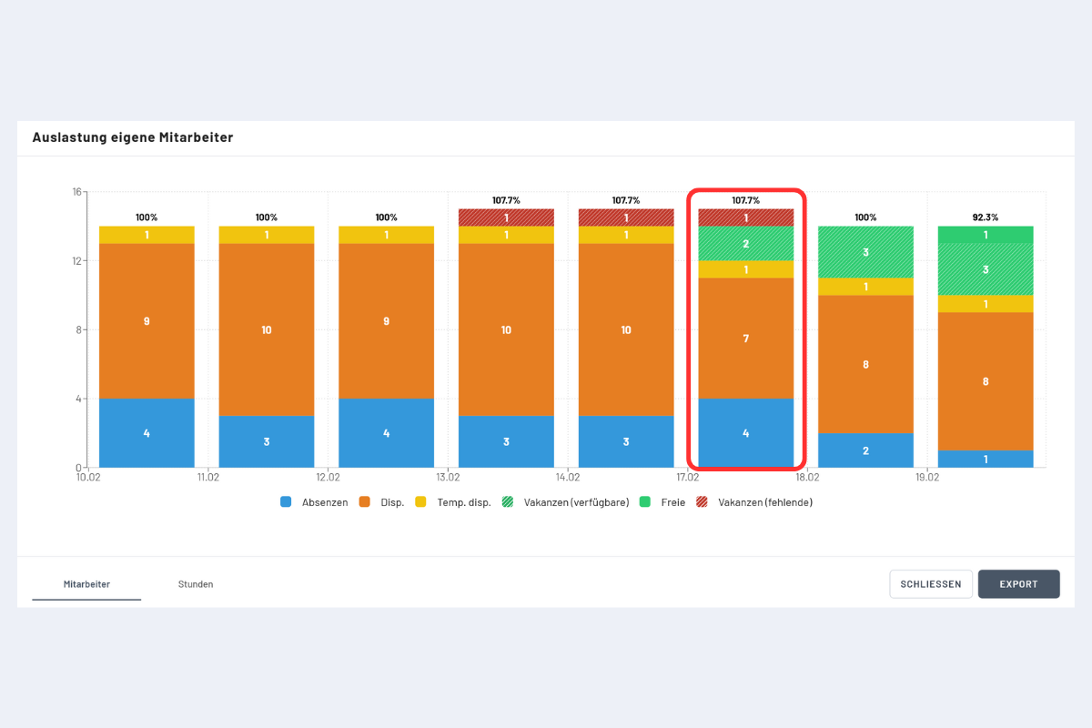
| Category | Colour | Count on 17 Feb. | Description |
|---|---|---|---|
| Absences | Blue | 4 | Employees on an absence booking. |
| Disp. | Orange | 7 | Employees on a project or service order. Note: info bookings with disposition rate > 0% also count. |
| Temp. disp. | Yellow | 1 | Temporary employees on a project / service order or an info booking with disposition rate > 0%. |
| Vacancies (available) | Green hatched | 2 | Vacancies that can be covered by own employees who are still available. |
| Free | Green (solid) | 0 | Employees who are available and not assigned to any vacancy. |
| Vacancies (missing) | Red hatched | 1 | Vacancies not covered by own employees (overload). |
What is a vacancy?
Vacancies are provisional bookings used in rough planning. They reserve capacity and define the required role (e.g. project manager, technician, apprentice) without a specific employee being chosen yet.
Example explanations for 17 Feb.
- Vacancies (available), green hatched: 3 vacancies booked, 2 available employees. Only 2 vacancies can be covered, count = 2.
- Free, green: 0, because the 2 available employees cover the vacancies. On 19 Feb. you can see the difference: 1 free employee and 3 covering a vacancy.
- Vacancies (missing), red hatched: 3 vacancies booked, only 2 available employees, 1 employee short. Count = 1, signalling overload.